Ranked-Choice Voting
A more effecient and effective voting process, empowering voters through choice.
CATEGORY
UI/UX, Prototying
TIME
5 weeks
TOOLS
Figma, Principle
PROMPT
Design an information campaign that explains what RCV is and how it works to prepare voters in advance of election day, an interactive ballot for use in the polls, and an animated presentation of the outcome. (This project does not express any political leniency.)
INTRO
What is RCV?
Ranked-choice voting (RCV) is an electoral system in which voters rank candidates by preference on their ballots. This makes sure votes get counted easily and not wasted on a single candidate.
Benefits of RCV
- Greater focus on candidates' values and policies
- Encourages candidates to maintain civility in campaigns
- Gives individual voters more power
TEAMWORK
Team Member & Roles


SOLUTIONS
Create a digital voting experience on a kiosk, featuring candidate ranking solutions with an intuitive and interactive ballot.
SOLUTION PREVIEW
The Ballot Experience
Introducing the new digital ballot experience! Users can easily select their candidates on the touch screen display. With a digital voting, users can rank and edit their candidates in their ballots much more easily, and the system will guide users and avoid user error.
RESEARCH
Primary Research
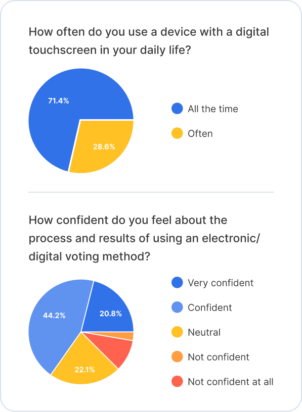
We surveyed 77 adults from age 18-71 across 11 different states.
TAKEAWAYS
- Familiar with touchscreen tech
- Concerned with voter fraud
- Trust issues + feeling uncertainty with RCV because of lack of knowledge
- People 35+ participate most in voting
- Lots of room for user error on touchscreen

Secondary Research
With the insights we got from our primary research, Anna also went online and collected some additional information.

GOALS
Our Scope
With a clearer understanding of the subject and our users, we came up with some goals to focus on.
We want to create a trustworthy experience, keeping users from doubting the legitimacy of the digital voting process. At the same time, we want to create a simple and intuitive interface for users to operate, ensuring an unbiased and accessible experience.
Trustworthy
Reduce user error
Unbiased
Accessible
USER FLOW
The Voting Process

WIREFRAMES
The Initial Ideas
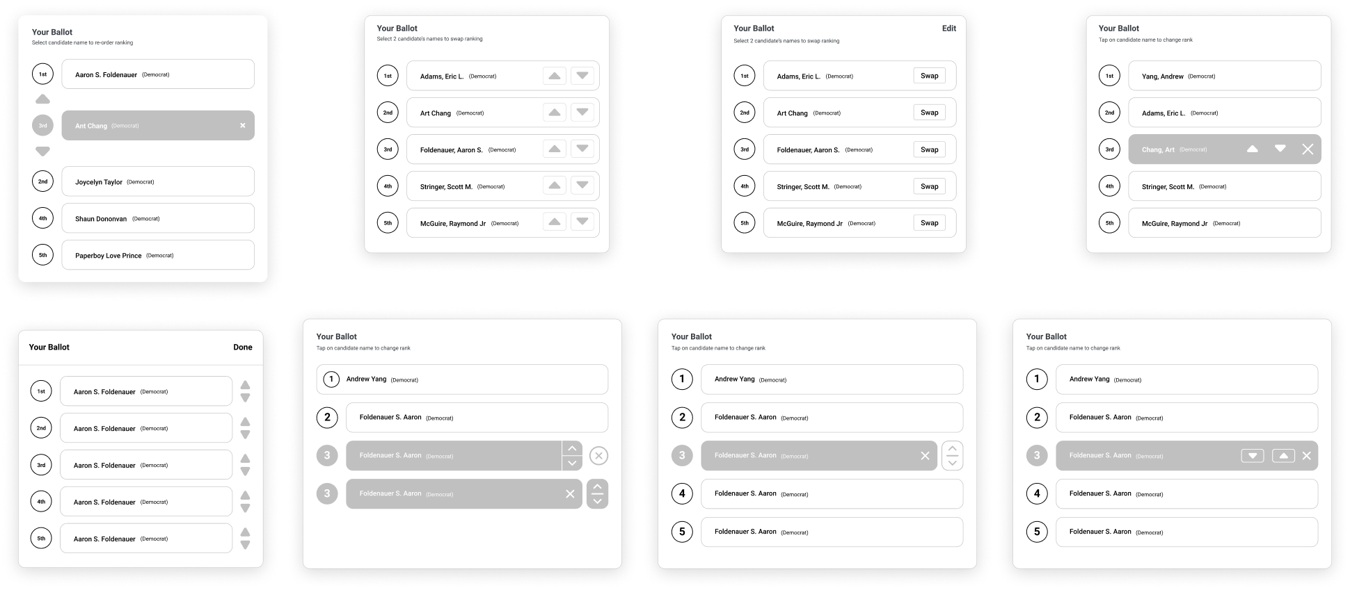
We experimented with a couple initial designs and ideate on different kinds of user experience.

Ballot Wireframes
We decided to have a ballot module for users to see live changes and what they have at the moment. It also allows them to edit.

COLLABORATION
Components
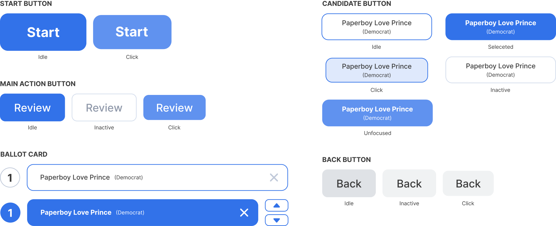
Working in a team, I developed a component library for my teammate and myself to ensure consistent styling.

FINAL SOLUTION
Landing Page
Users are provided simple instructions of the voting process, making sure they understand how to operate the kiosk.
FINAL SOLUTION
Candidate Selection
The candidates are listed clearly to users to select and rank, making the process as as simple and clear as possible to users.
FINAL SOLUTION
Edit Candidates
Users are able to reorder the candidates in the ballot module, giving them the option to edit their selection.
FINAL SOLUTION
Need Help
In case some users get confused and have questions during the voting process, they can request an official poll worker to come help them.
REFLECTIONS
What I learned
Collaboration
Working with a group of designers and developers, I learned to be more active through communication, such as updating my teammates on my progress or leaving comments on my teammates work. I also learned ways to communicate with developers who are not necessarily familiar to design workflows, using language that they would understand and clear breakdowns of ideas.